News section redesign for BOŚ Bank
Project overview
BOŚ Bank is one of Poland’s well-known financial institutions. Analysis of the existing homepage revealed that the News section dominated the page despite being a secondary feature. Important banking products and CTAs were pushed below the fold, while users had difficulty scanning recent articles due to inconsistent hierarchy and excessive whitespace. My responsibility was to redesign this section to improve clarity, usability, and visual balance while ensuring it remained aligned with the bank’s communication standards and continued to deliver value to users.
My role
I was responsible for the project from initial research through interface design. I identified a content hierarchy problem, researched how other financial institutions solved it, worked within the constraints of an existing banking design system, iterated on several concepts, justified each design decision, and delivered a solution that was selected for implementation.
Methodology
Analysis & conception
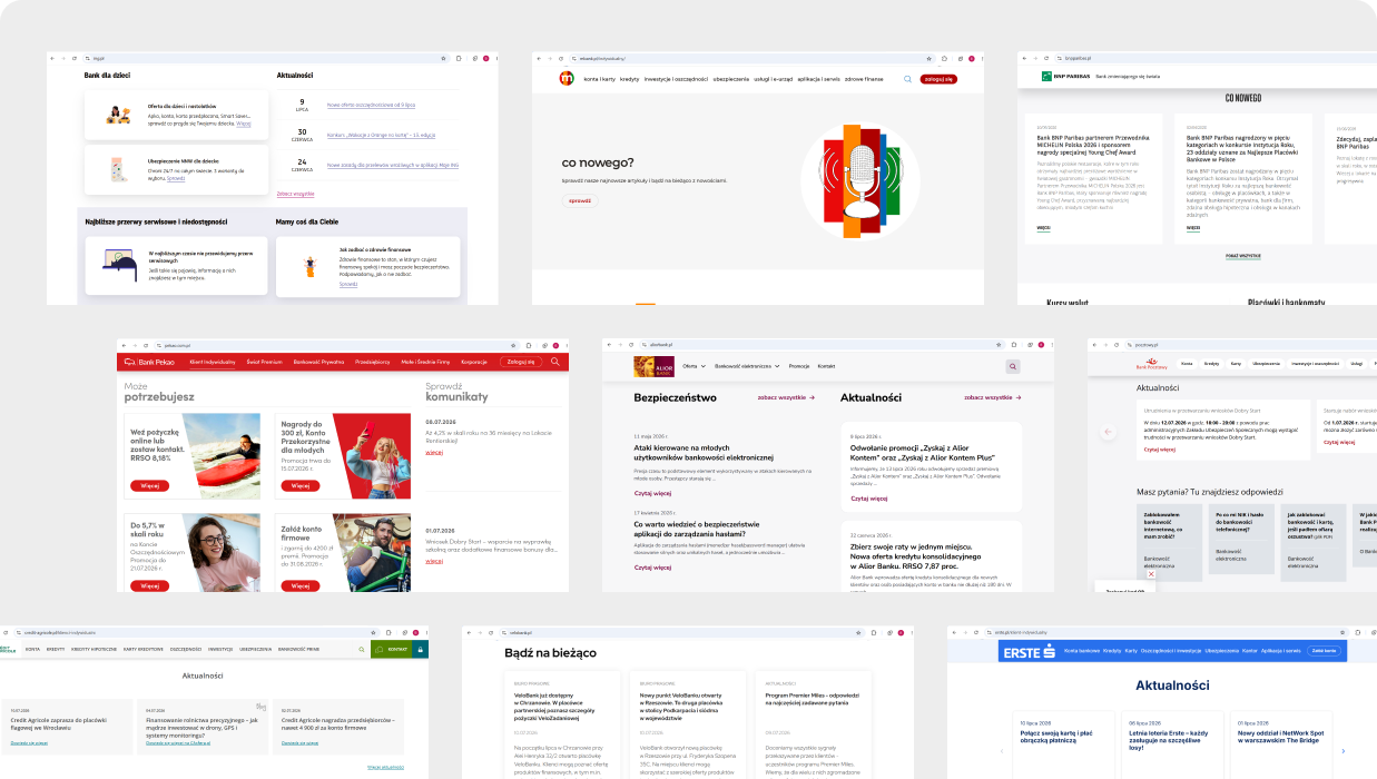
I analyzed digital experiences from leading European banking platforms to understand how news and editorial content is structured within their websites. The research focused on content hierarchy, layout patterns, card-based components, information density, and the way users are guided toward key actions and relevant information. Combining these findings with insights provided by the client, I moved on with mind maps to organize observations and explored multiple layout directions through initial sketches, testing different content structures and visual arrangements before progressing into wireframes and final interface concepts.
Design process
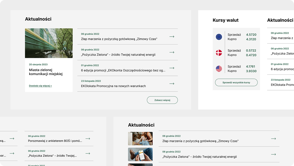
Instead of creating new components from scratch, I adapted and combined existing patterns to ensure consistency with the brand identity, accessibility standards, and established digital guidelines. Based on the research insights, I developed four different concepts for the News section, each exploring a different approach to content hierarchy and user interaction. The concepts were refined through design reviews, internal discussions, and feedback sessions. Stakeholders consultations helped refine the selected direction and ensured that the final proposal addressed both user needs and the practical requirements.
Final outcome
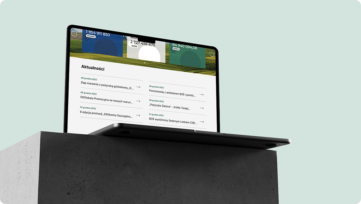
The final direction focused on creating a more compact and efficient News section based on a simplified list of article titles. This approach reduced the visual weight of the section while allowing users to quickly scan available content and access relevant information with less effort. By reducing unnecessary spacing and simplifying the article presentation, the section became more balanced within the overall page structure.
.png)