Redesign of basket and product filtering system for iRobot
Project overview
iRobot is a global leader in consumer robotics and smart home technology, recognized for its innovative approach to automated home care through products such as Roomba robotic vacuum cleaners and Braava floor-mopping robots. This project focused on redesigning key parts of the iRobot e-commerce experience, including the product filtering system and shopping basket flow.
An analysis of the existing shopping journey revealed opportunities to improve product discoverability, reduce friction during decision-making, and create a more intuitive path from product exploration to checkout. The filtering experience required clearer categorization and improved information structure to help users compare products more efficiently, while the shopping basket needed a more streamlined layout to support confident purchasing decisions.
My role
I was responsible for the project from initial research through high-fidelity design solutions. I evaluated existing user flows, identified usability issues, explored improved information architectures, and created design concepts for the filtering system and shopping basket experience. Additionally, I designed a temporary maintenance page to ensure a consistent user experience during the development phase when new website elements were being implemented and parts of the platform were temporarily unavailable.
Methodology
Research & analysis
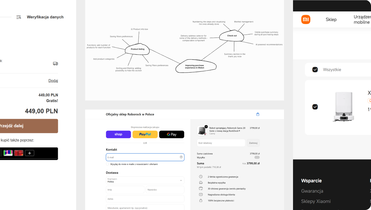
I analyzed the existing iRobot e-commerce experience alongside market research of leading consumer electronics and smart home brands to understand current industry practices in product discovery, comparison, and checkout flows. The research showed that users selecting smart home products require clearer information about product features. The checkout analysis highlighted the importance of minimizing unnecessary steps, maintaining visibility of essential information such as pricing, delivery details, and product summaries, while reducing distractions during the final conversion stage.
Conception
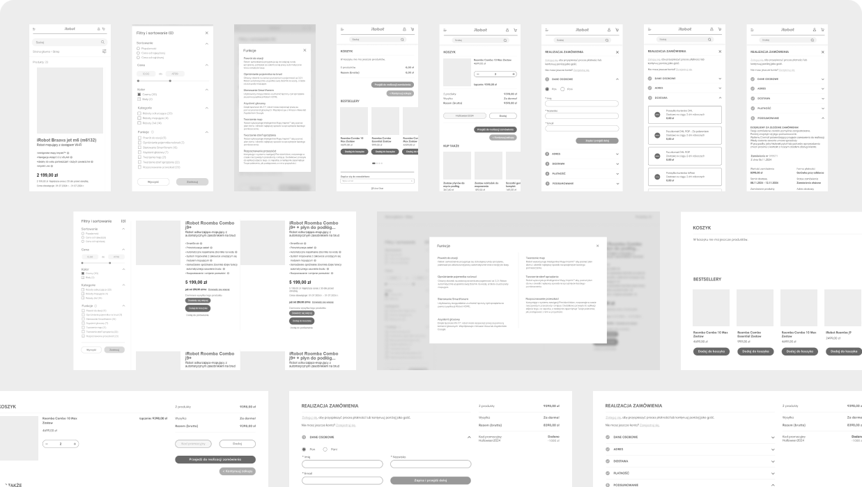
I began the ideation phase by creating mind maps to organize user needs, business requirements, and key functionality identified during the analysis. These were followed by a series of quick hand-drawn sketches that allowed me to explore different approaches to the filtering system and shopping basket without committing to a single solution too early.
The selected concepts were translated into wireframes, where the focus shifted to refining information architecture, interaction flows, and component hierarchy. Following a mobile-first approach, the layouts were designed to perform effectively on smaller screens before being scaled to larger breakpoints.
Design process
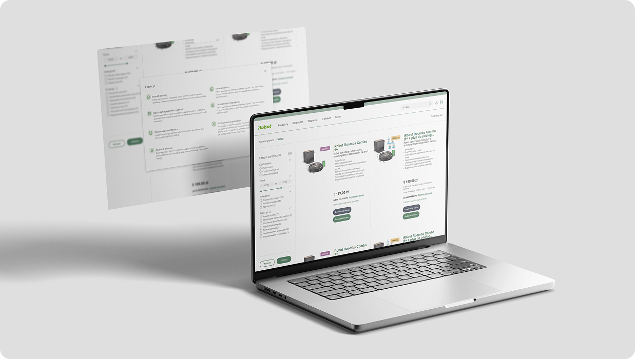
The product filtering experience was redesigned to provide users with greater control over product discovery. New filtering and sorting options were introduced, allowing users to narrow down products based on relevant criteria and organize results more efficiently. To reduce the need for repeated navigation between listing and product pages, additional product information was made available directly within the filtering component, enabling users to compare key specifications and make more informed decisions earlier in the shopping journey.
Final outcome
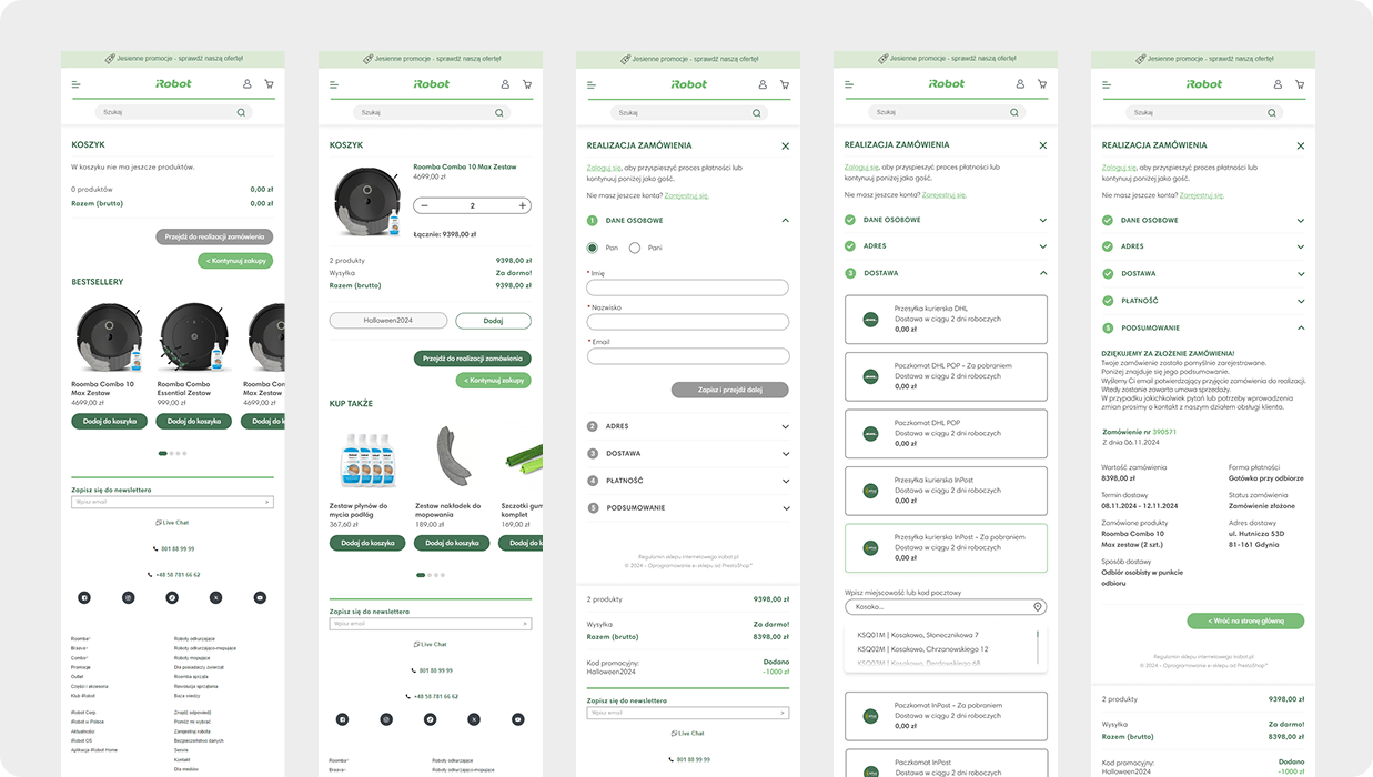
Following a mobile-first approach, the filtering interface was restructured into a dedicated full-screen experience on smaller devices, improving accessibility, reducing visual clutter, and providing larger touch targets for easier interaction.
The shopping basket was also redesigned as a structured, step-based flow that guides users through each stage of the checkout process. The layout prioritizes essential information, including selected products, pricing, and the order summary, while strategically incorporating complementary product recommendations to encourage additional purchases without interrupting the checkout experience.
The implementation of the redesigned shopping experience helped reduce user drop-off during checkout and increase in users adding complementary products to their basket while maintaining a focused and frictionless checkout experience.
.png)